

Editorial Design Collaborative Project:
Olivia King
The Goal:
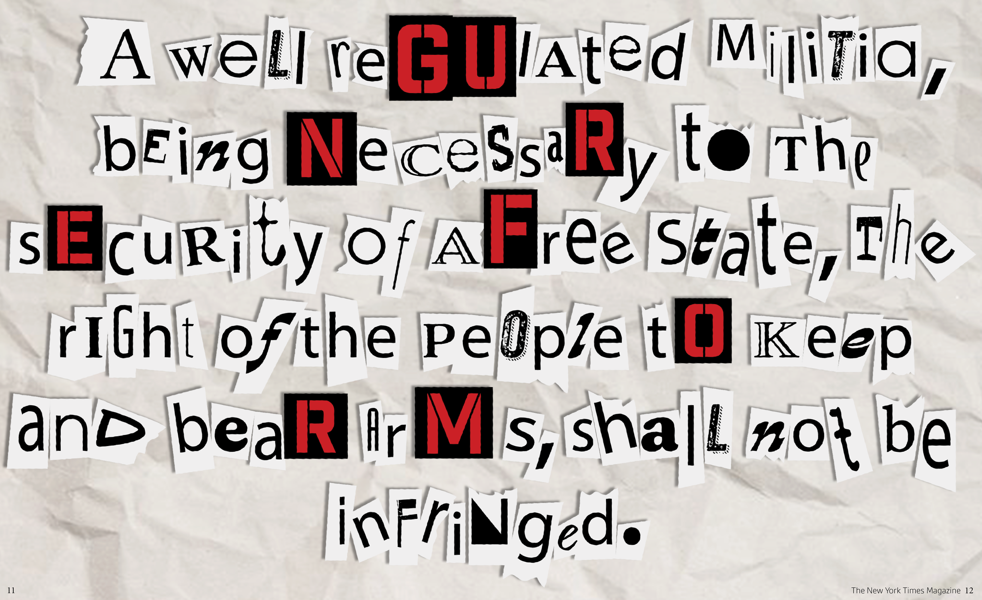
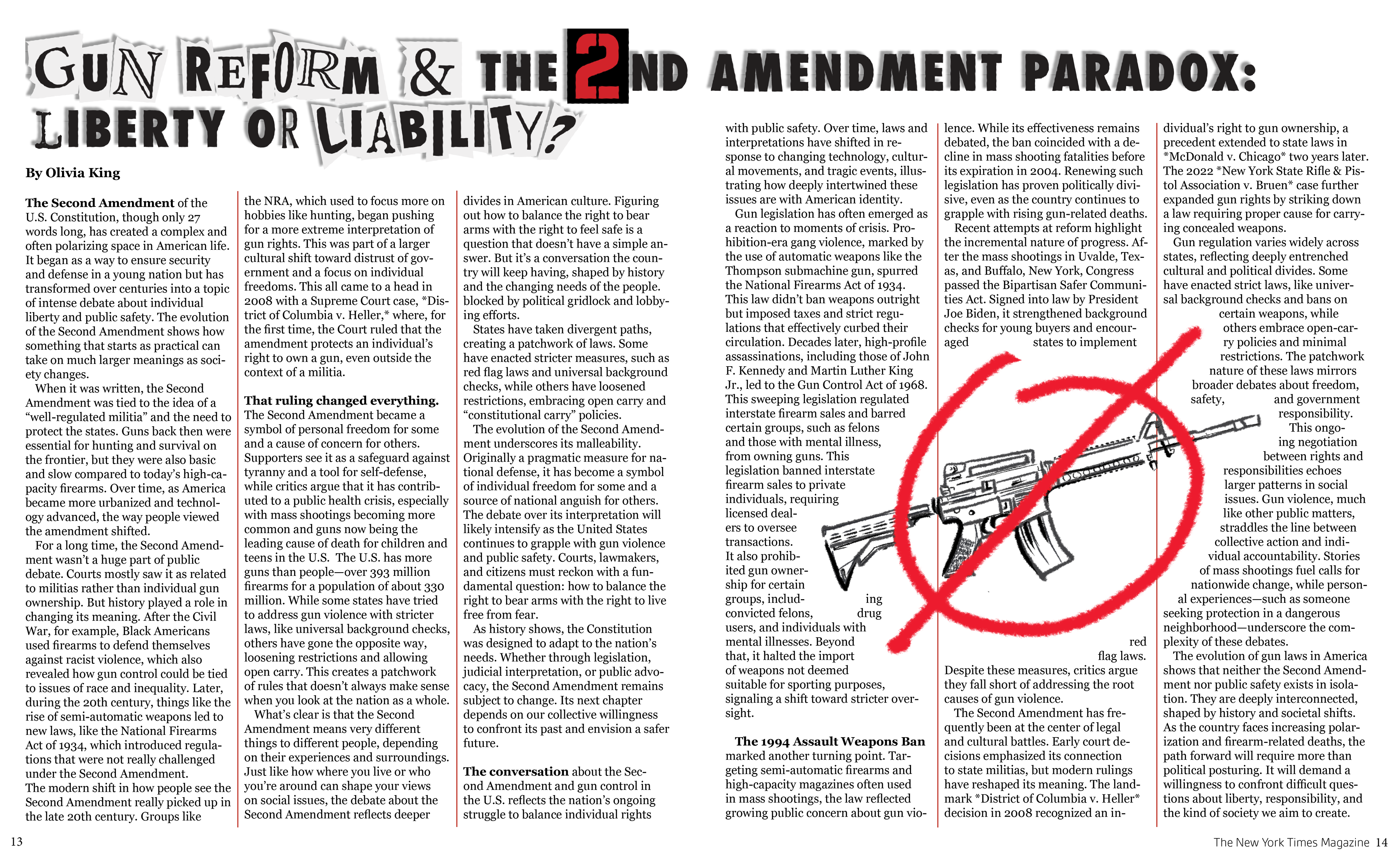
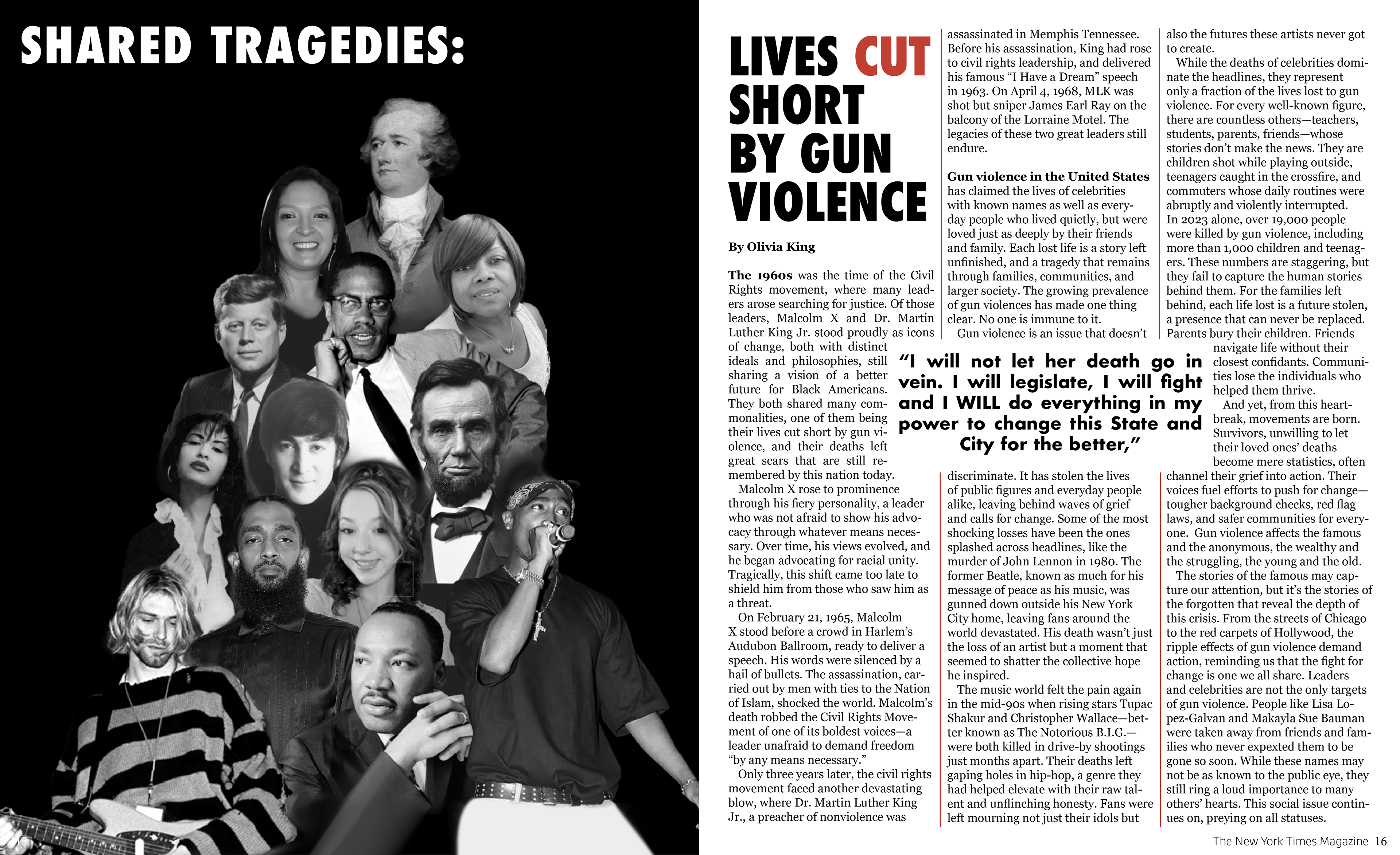
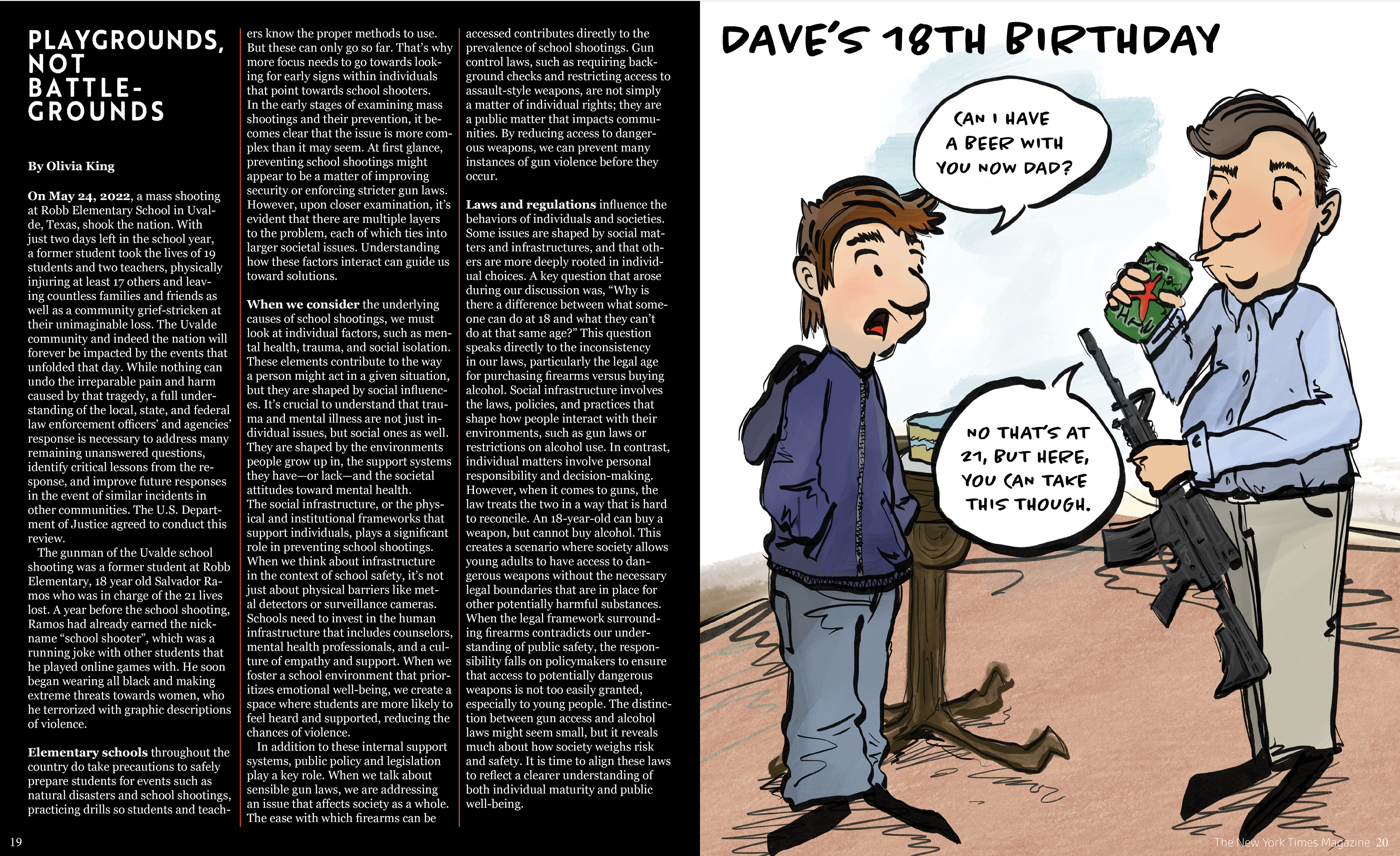
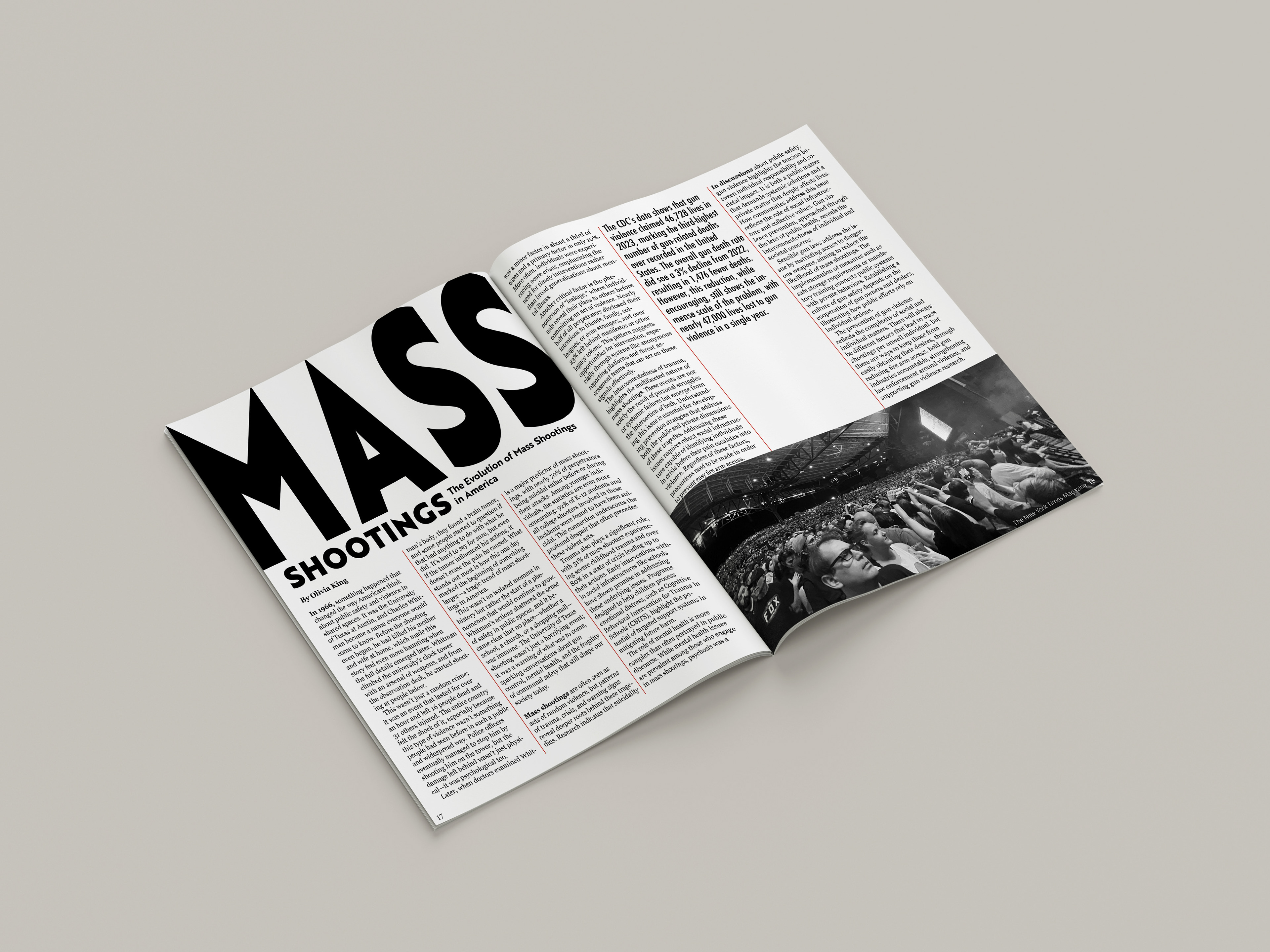
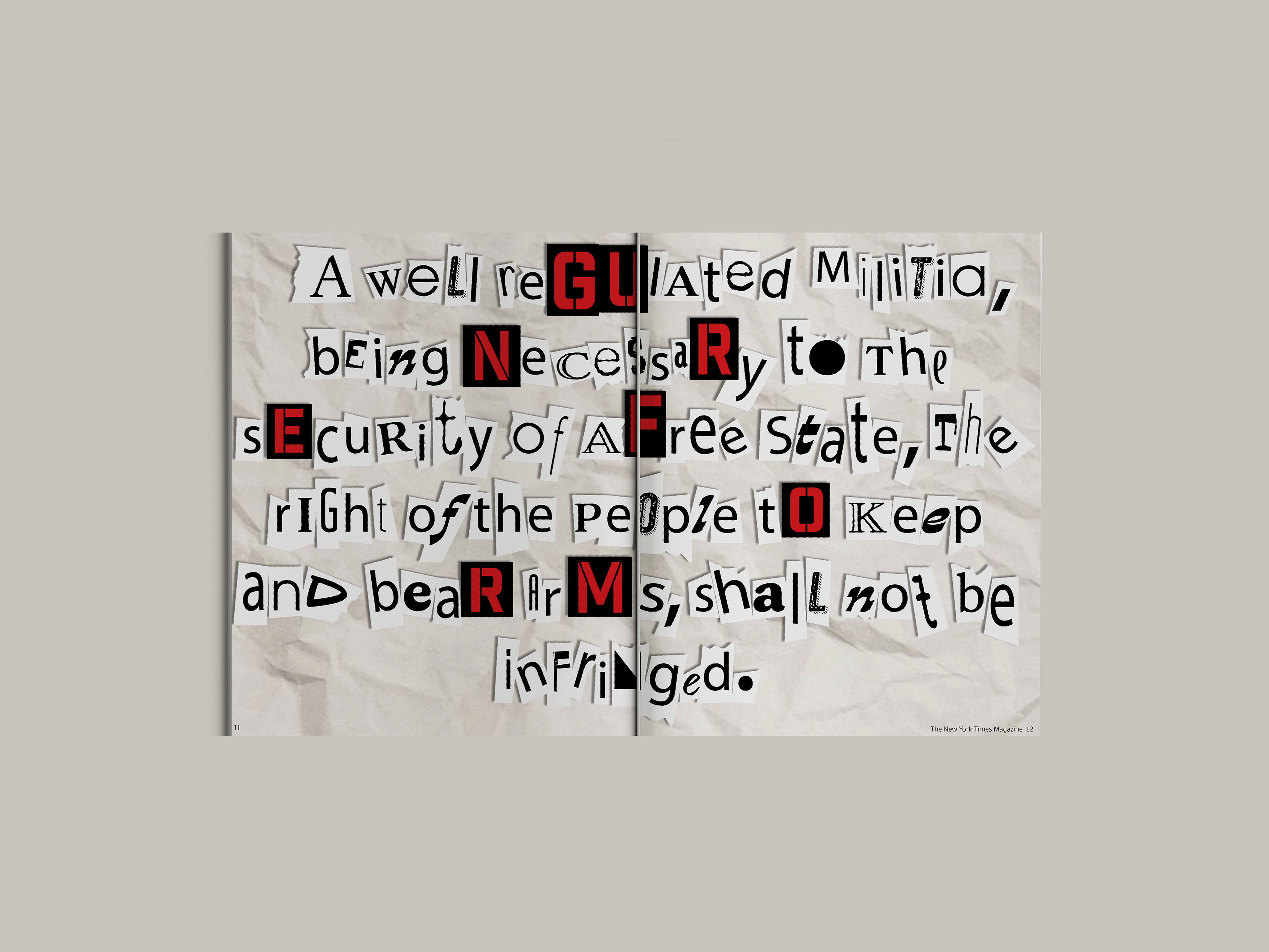
The initial project involved the collaboration of two team members, (myself and one other partner) in designing two covers and a 20-page editorial (10 spreads) in the style of an existing Magazine, centered around our chosen topic of gun violence. We were individually responsible for designing one cover and ten pages (5 spreads) of content. Our team wrote articles based on research on our topic, utilizing our own visuals, each contributing at least one original illustration, one photograph, and one typography element. (This portfolio only contains my portion of design work)
The Topic:
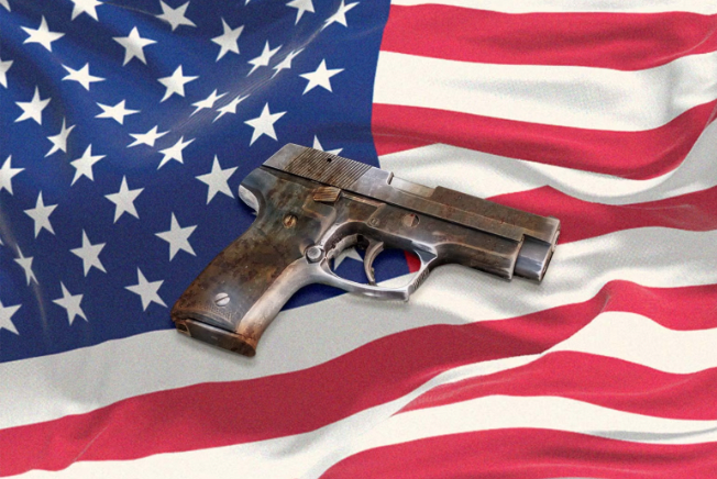
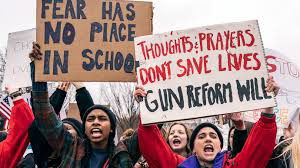
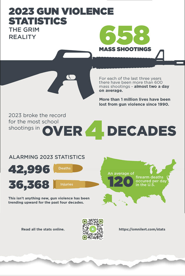
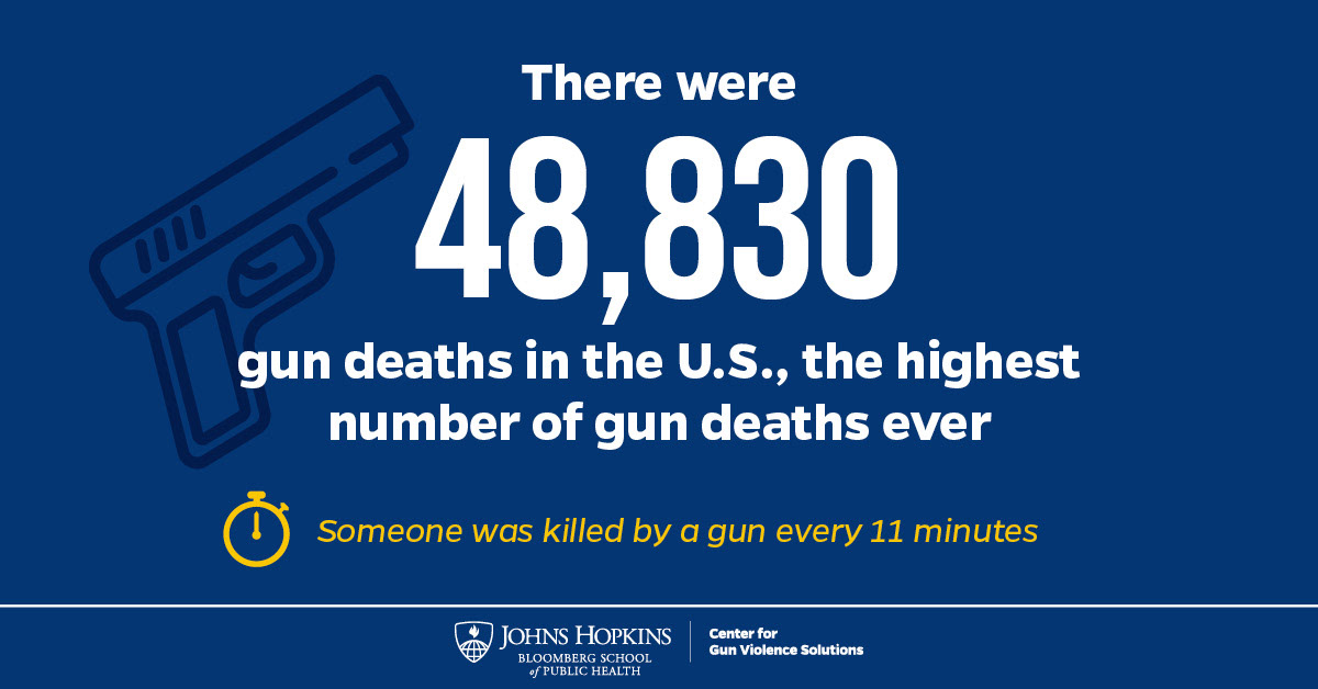
Our magazine focuses on the topic of gun violence and control. Firearm violence is a preventable public safety issue affecting communities across the U.S. Throughout our spreads we discuss a multitude of topics, from the beginning of the second amendment, protests and avocation, root causes, mass shootings, gun regulation all the way to specific issues like ghost guns.

Whats the Problem?
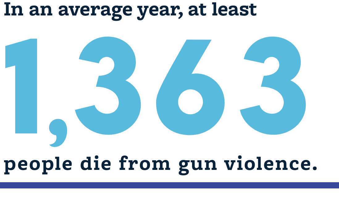
Gun ownership and access is associated with suicide, homicide, unintentional firearm deaths and injuries. Firearm violence is a preventable public safety issue affecting communities across the U.S, and debate on whether regulations on a individual’s right to bear arms as stated in the Second Amendment are an undue restriction on liberty or gun regulation is necessary in order to prevent gun violence in the US from a variety of factors.
The NYT Magazine:
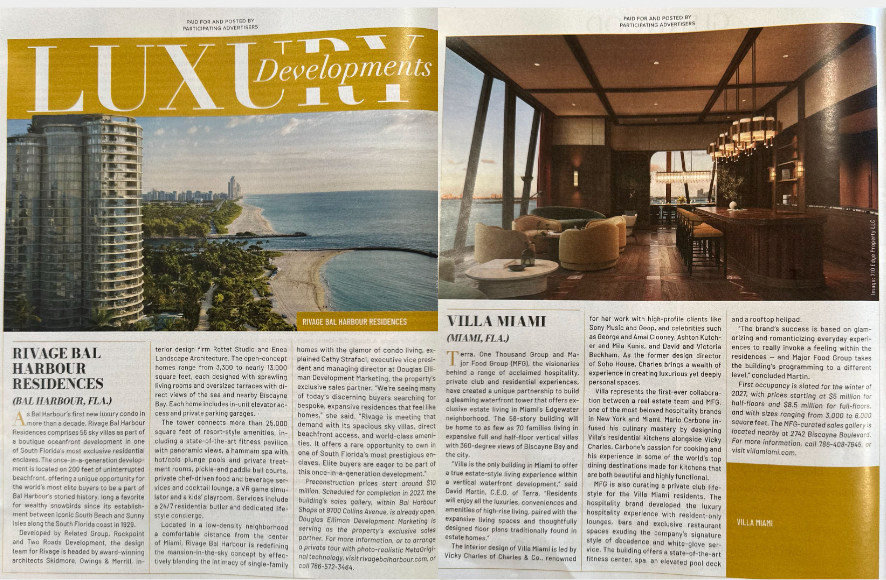
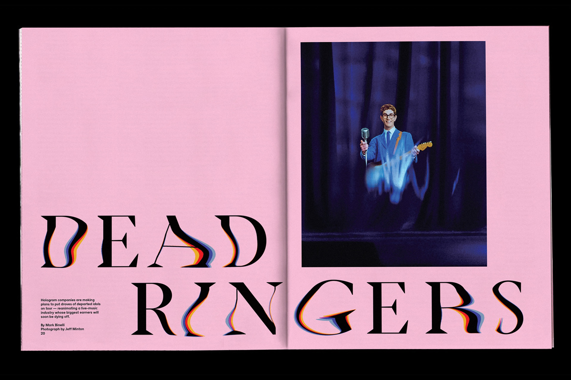
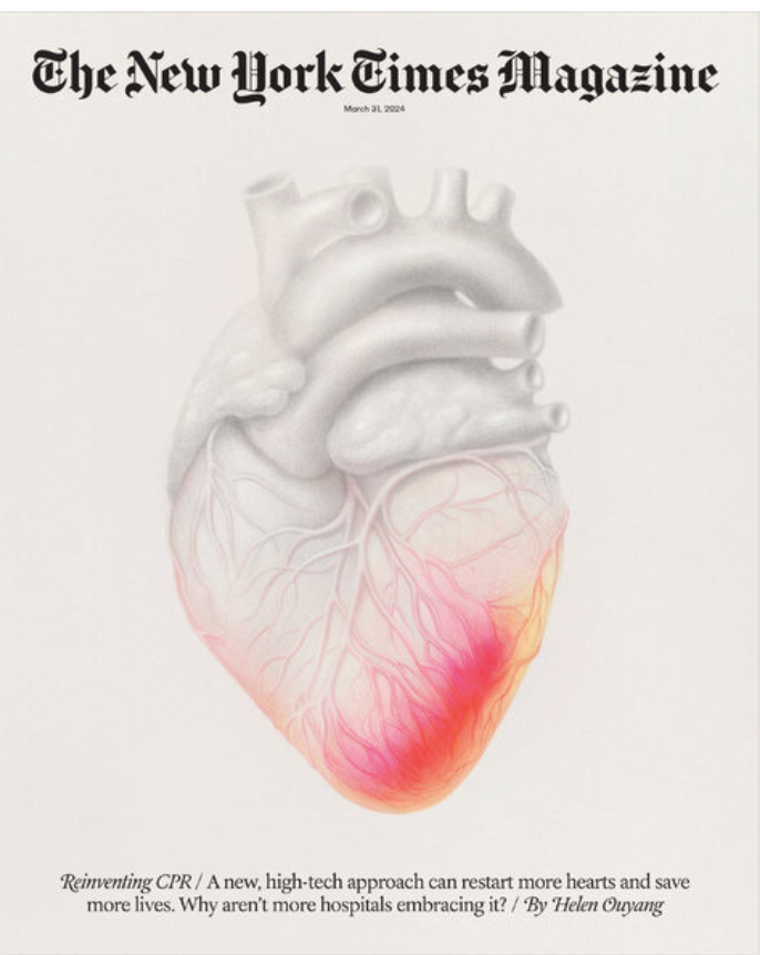
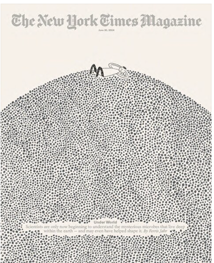
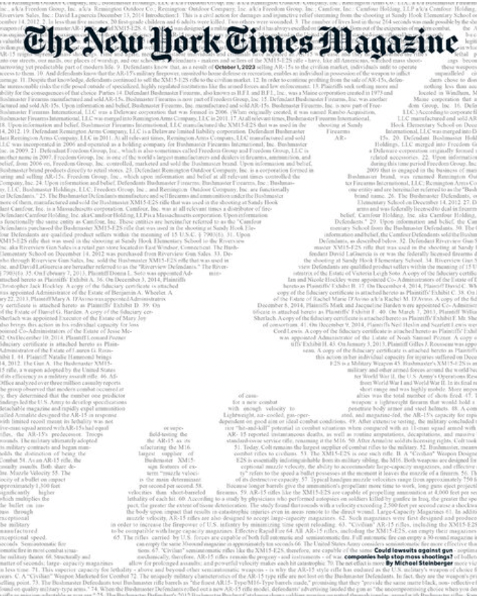
The New York Times Magazine is a weekly publication accompanying its Sunday edition, The New York Times, which covers a wide range of information focusing on culture and lifestyle topics, using more in depth feature articles, often with a more personal view, than what’s found in their newspapers.
Typography:
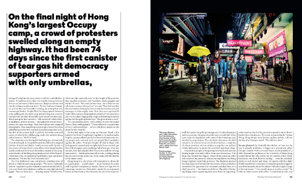
NYT has its own custom fonts/typefaces that they use throughout their magazine that are not available for public use. That being said, we did research on fonts similar to NYT custom fonts. We decided to go with a similar font to the NYT Mag Sans, Futura, for our bylines, some headlines, and our supporting information in between columns in our articles. NYT also switched its body from Times New Roman to Georgia, so we also used Georgia for our body text.

Color Scheme:
NYT Magazine mainly consists of just black and white, however, they do incorporate hints of red throughout their spreads. They also implement other color variants when discussing certain topics based on the compositions. For our magazine, we chose to keep it minimalistic in terms of color (for our text and layouts) however we did decide to incorporate hints of red.

Whitespace:
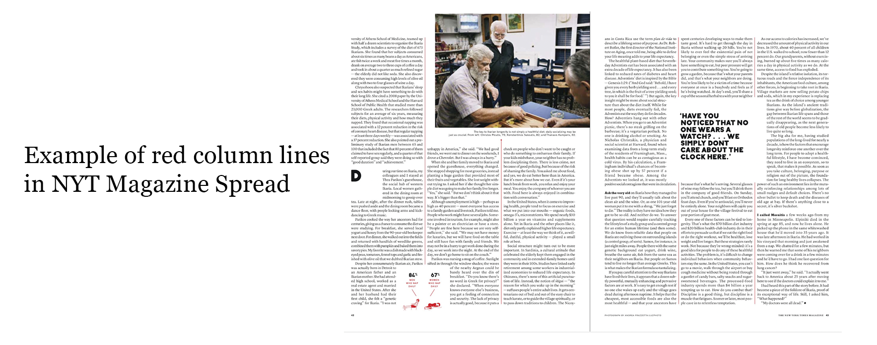
NYT magazine uses white space throughout a variety of spreads in order to compliment each visual element, whether it be photography, illustration, or typography. While doing research on the magazine, we recognized that lots of the magazine’s spreads have lines in between their columns to complement the columns as well as the use of whitespace between them. We also found that some of their spreads used their red color for the lines. As a result, we decided to incorporate red lines in between our columns cohesively throughout our magazine.
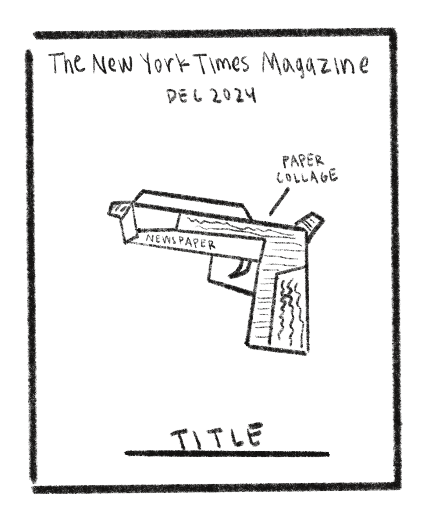
Cover Sketches
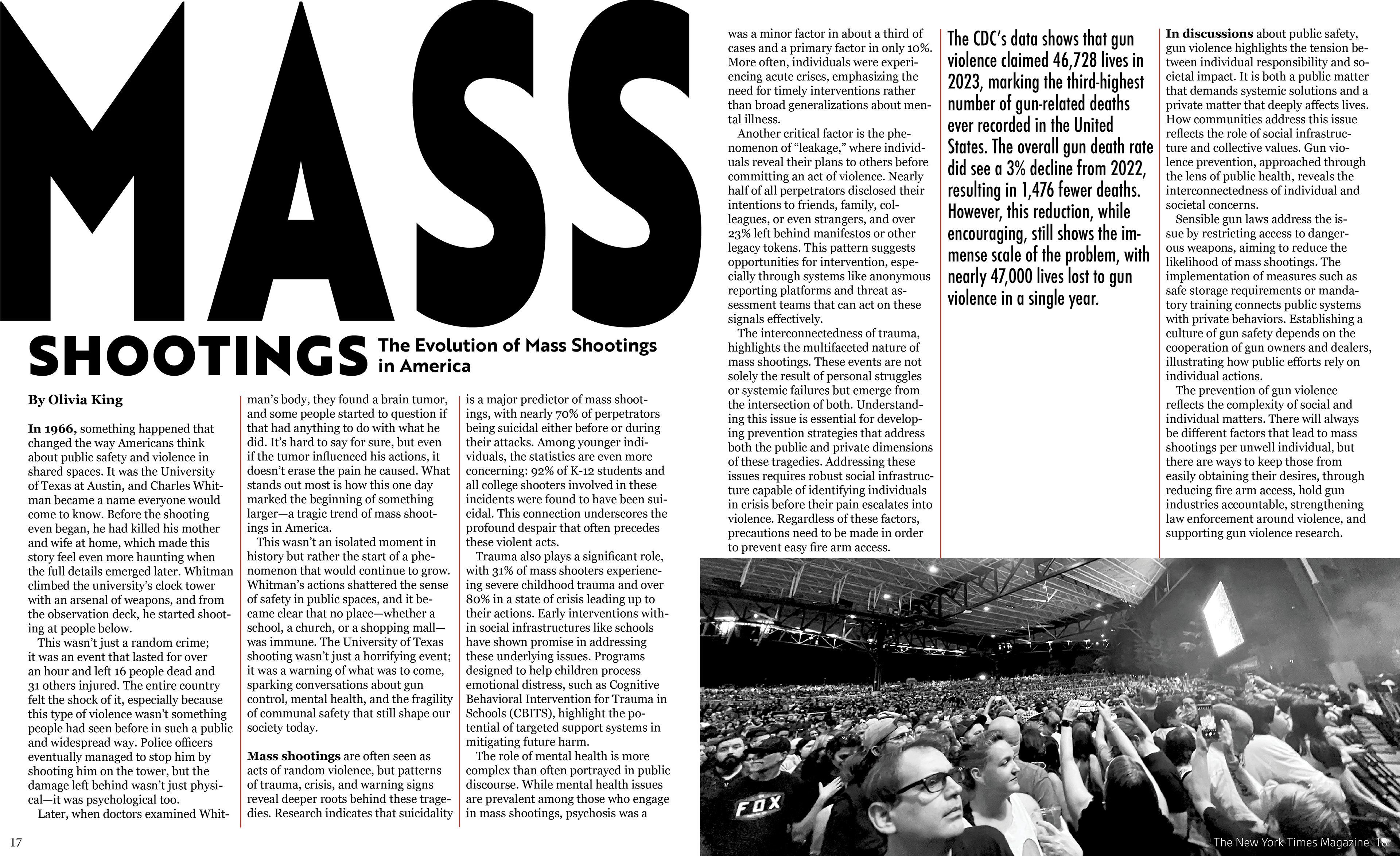
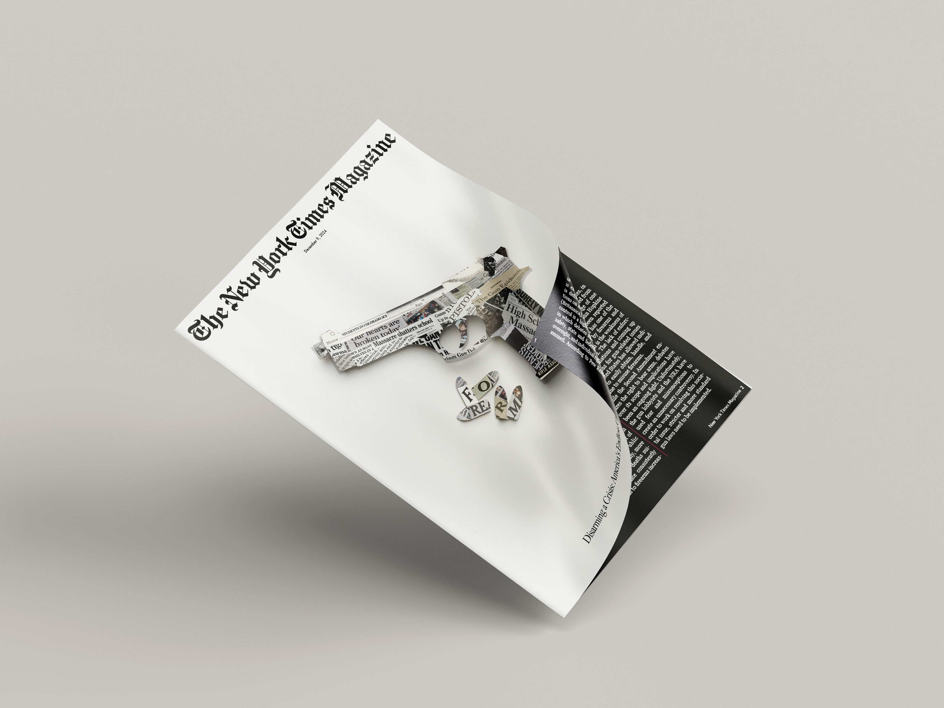
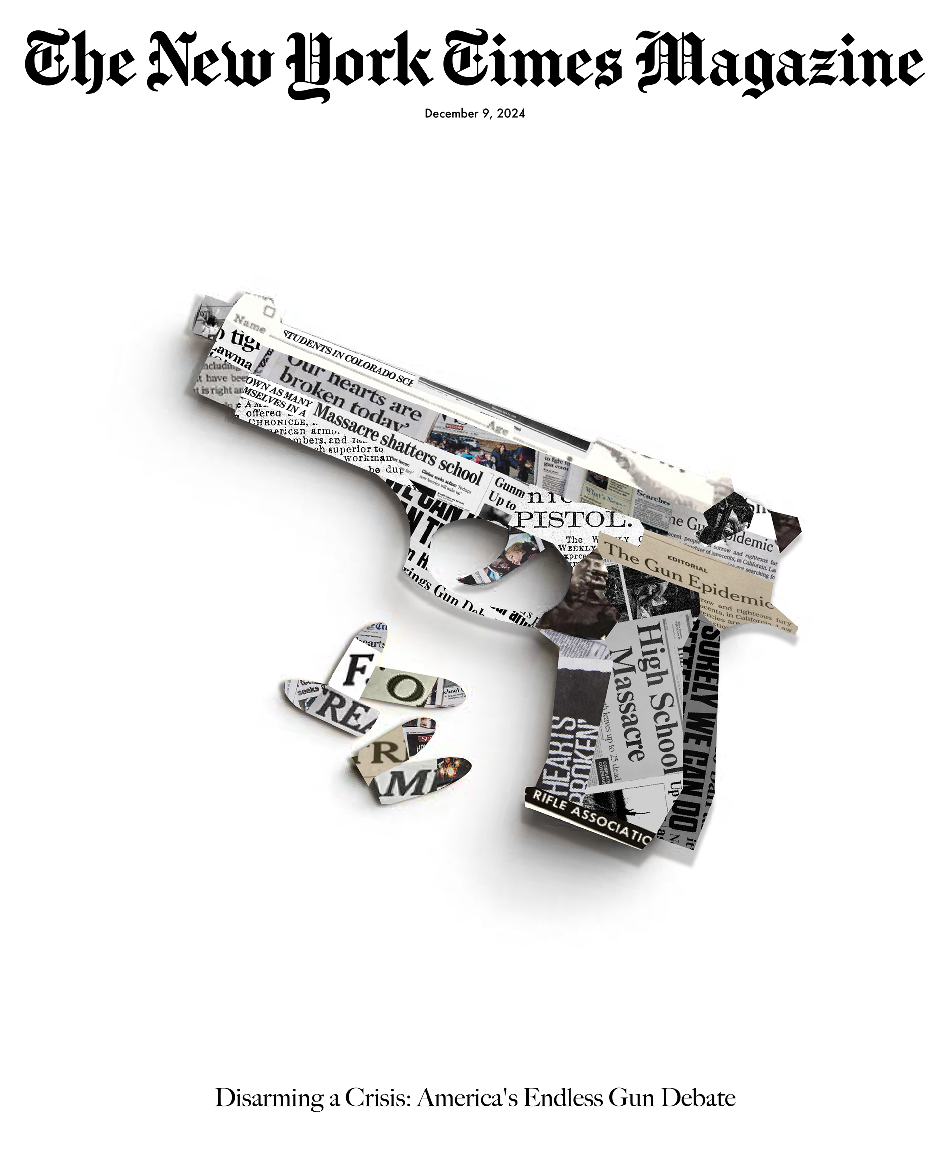
We first began creating our magazine cover ideas, which were then transformed into unique designs that maintained The New York Times Magazine simplicity of text placement.
Final Cover
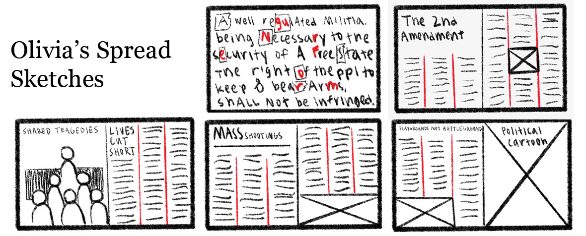
Spread Sketches
After choosing subtopics for each of our spreads, we began drafting our magazine spread layouts in order to have a solidified 10 page spread that did not severely overlap in ideas. After creating the first version of our spread drafts, we took peer feedback and began working towards our final spread
Spread Drafts:
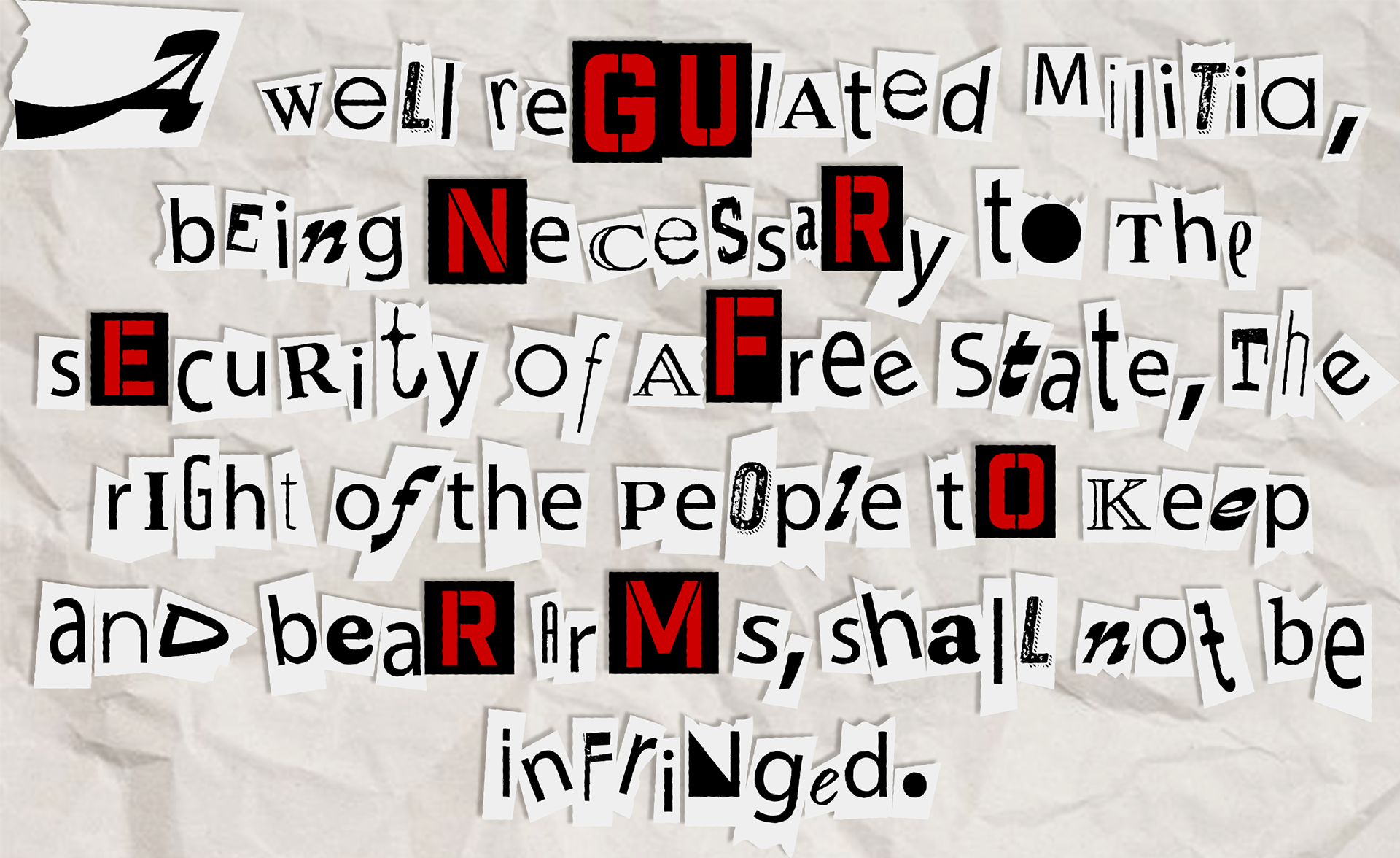
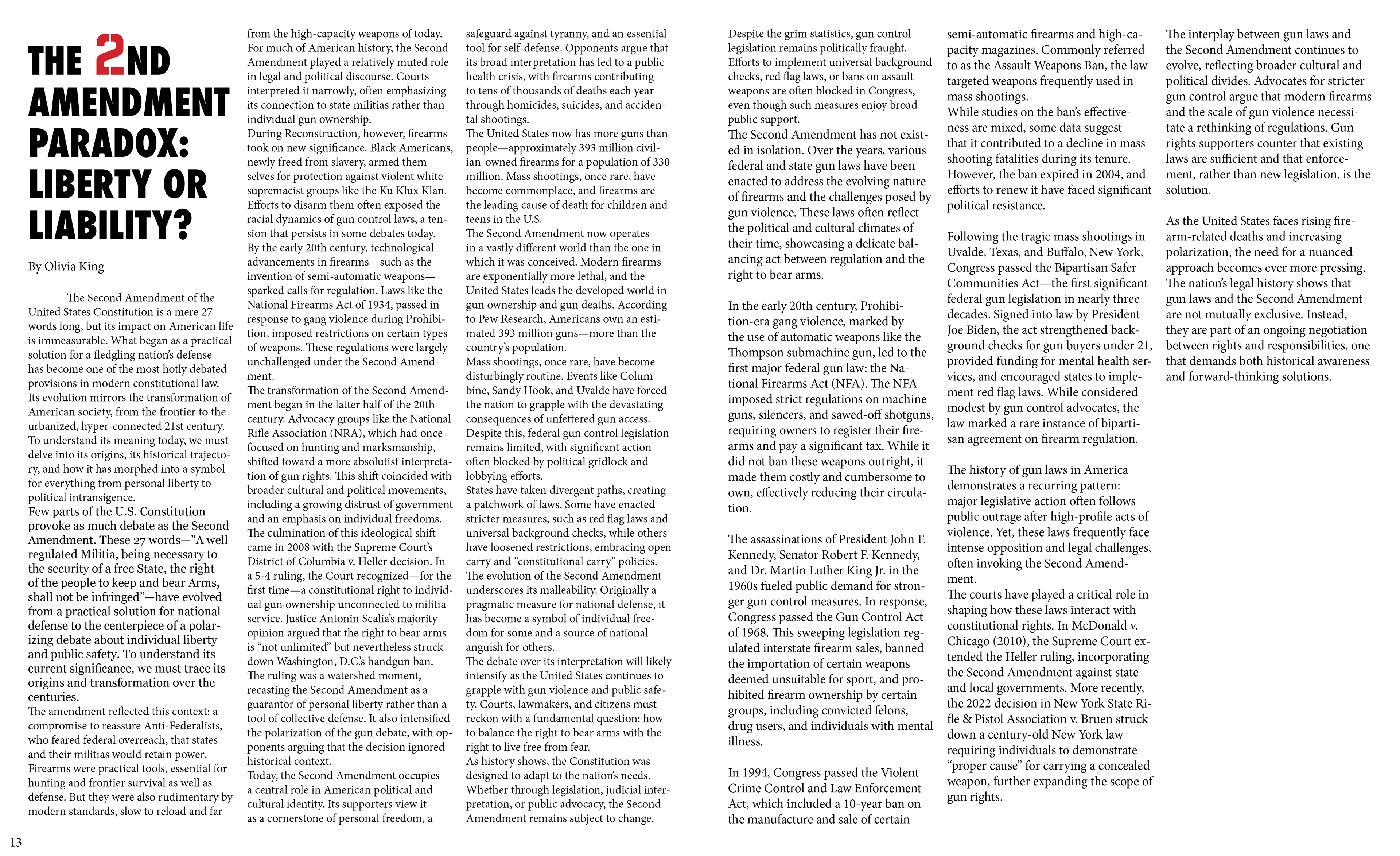
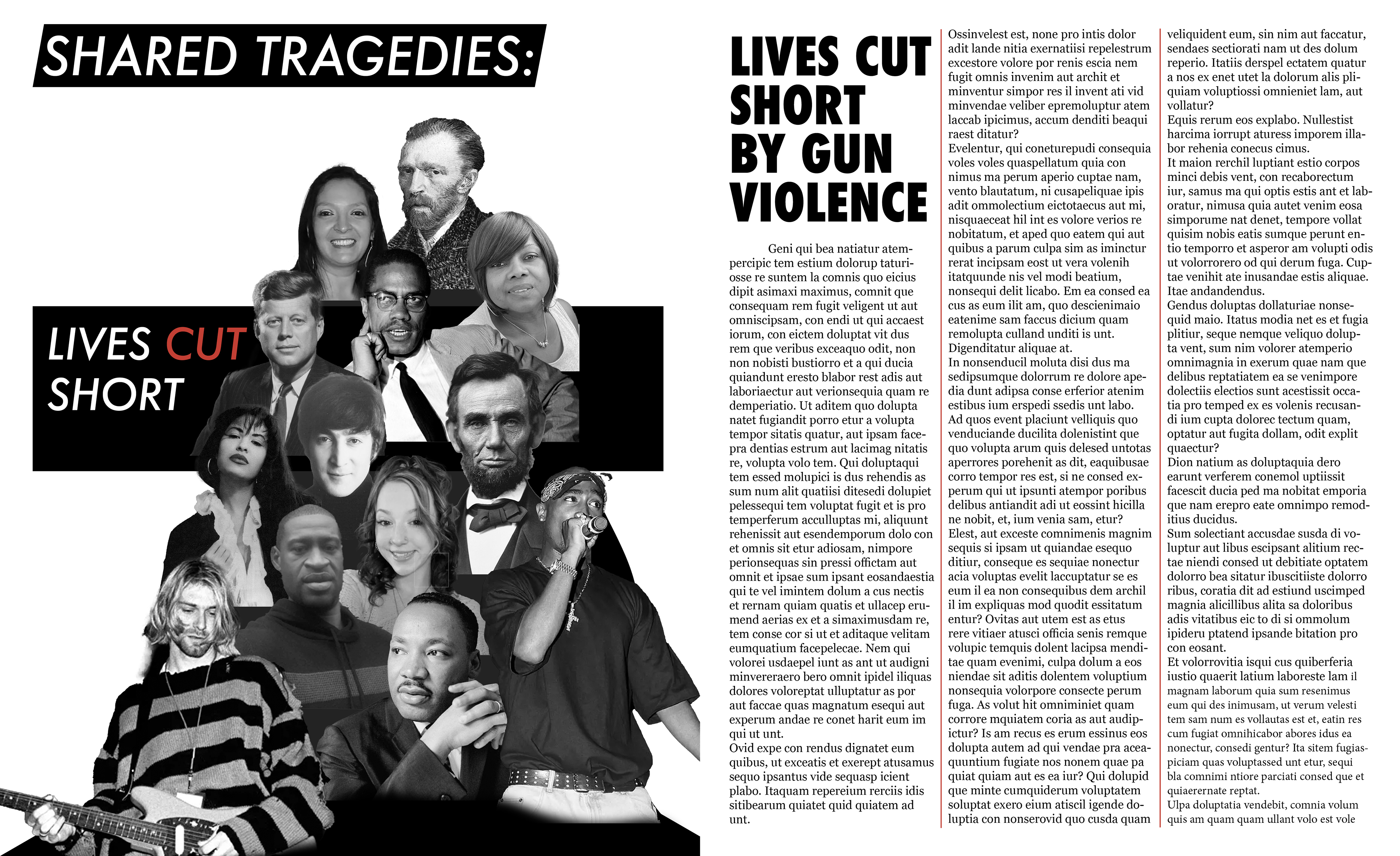
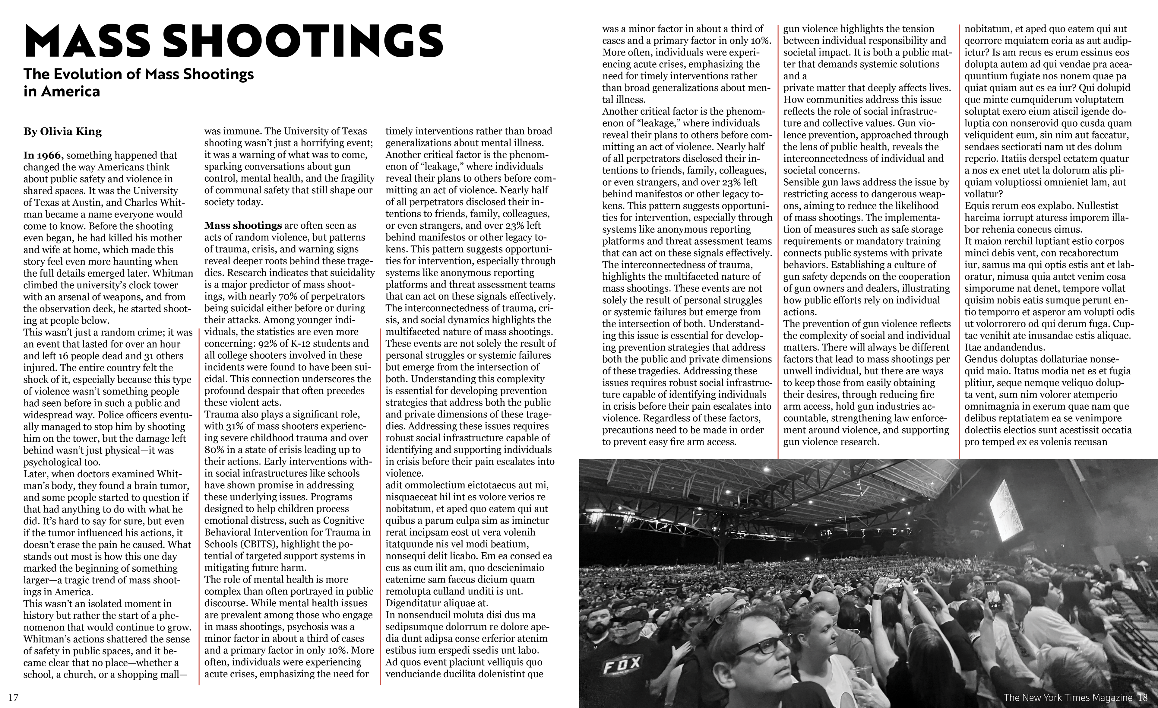
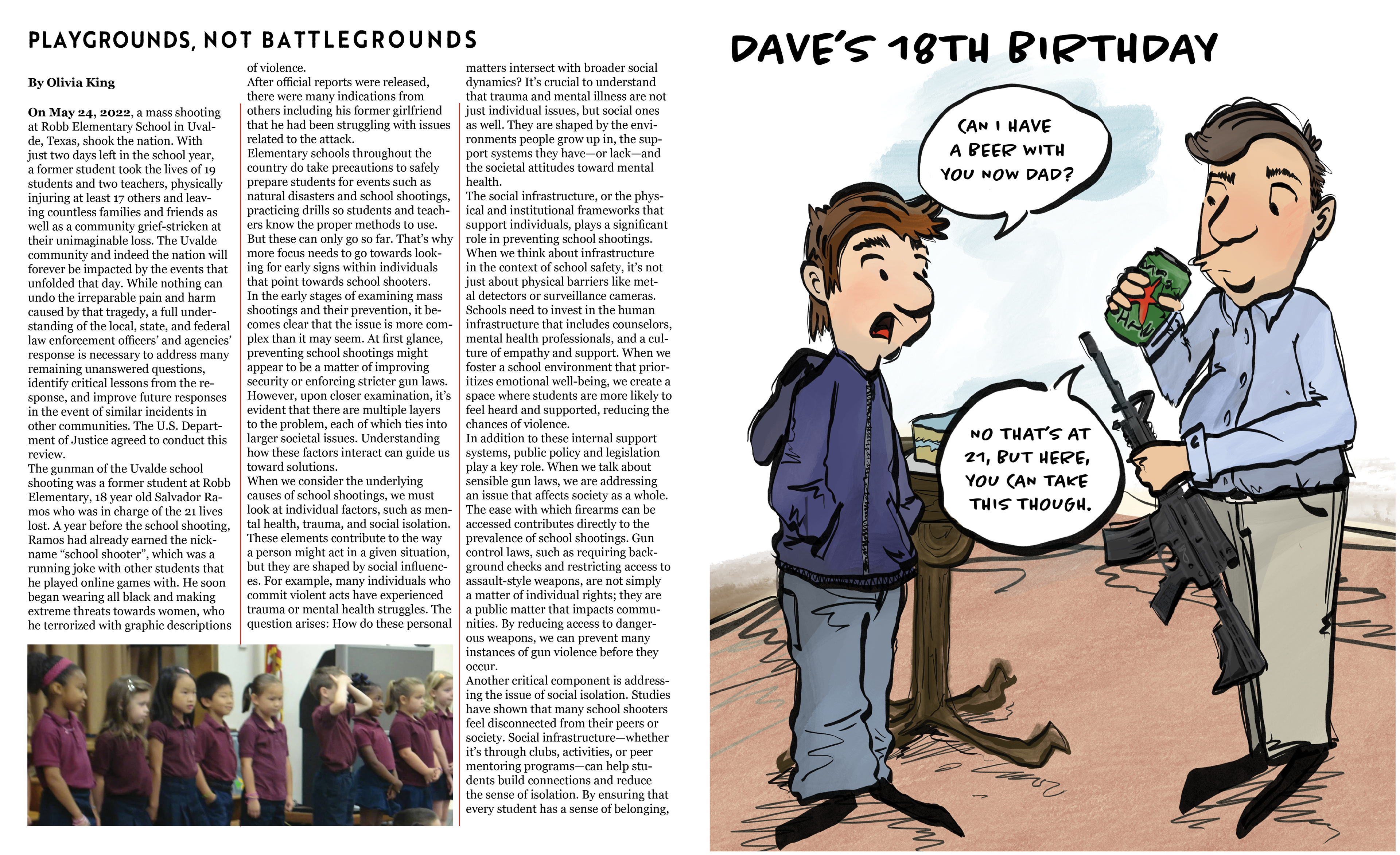
Final Versions